While looking for inspiration for a new design for a business card, I found this: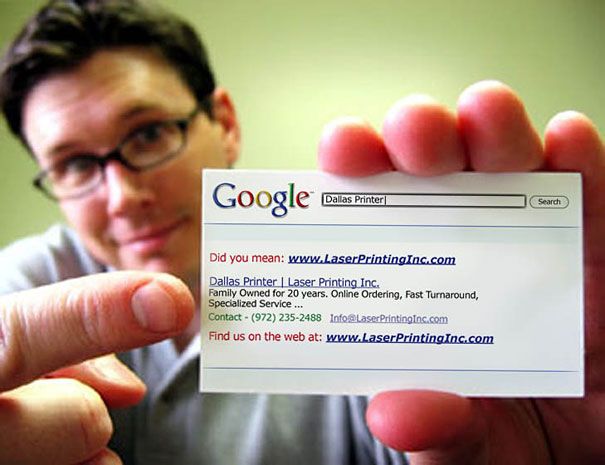 Since I want to reinforce my SEO skills and results as part of my personal branding, I decided to make a business card look like a Google search result. I chose the layout of a well-indexed search result because I wanted to add skills and contact information separately under their own headings. I liked the “Did you mean” part not only because it’s instantly recognizable (Who among us hasn’t made a typo?), but because it gives me a chance to imply I am Google’s top search result…the one you’ve been searching for, providing the best match for your desired skills.
This also gives me a chance to show off design skills and my familiarity with another Microsoft program since I used Microsoft Publisher. I have also designed brochures and other items using this program. I am an advanced Microsoft Office Suite user and completed a course in advanced Microsoft Office programs in early 2018 in addition to constant update and expansion of my skills.
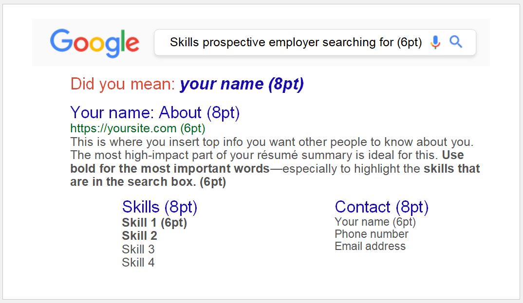
Here’s what I wanted my business card to look like:
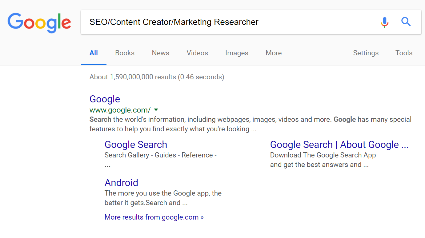
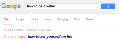
I removed the 2 rows below the search window for space and added the “did you mean” segment. True to Murphy’s law, it’s rather difficult to get Google to show you a “Did you mean” result when you want to make a screenshot. I found a similar meme with the look I was trying to recreate:
Result of first rough draft:
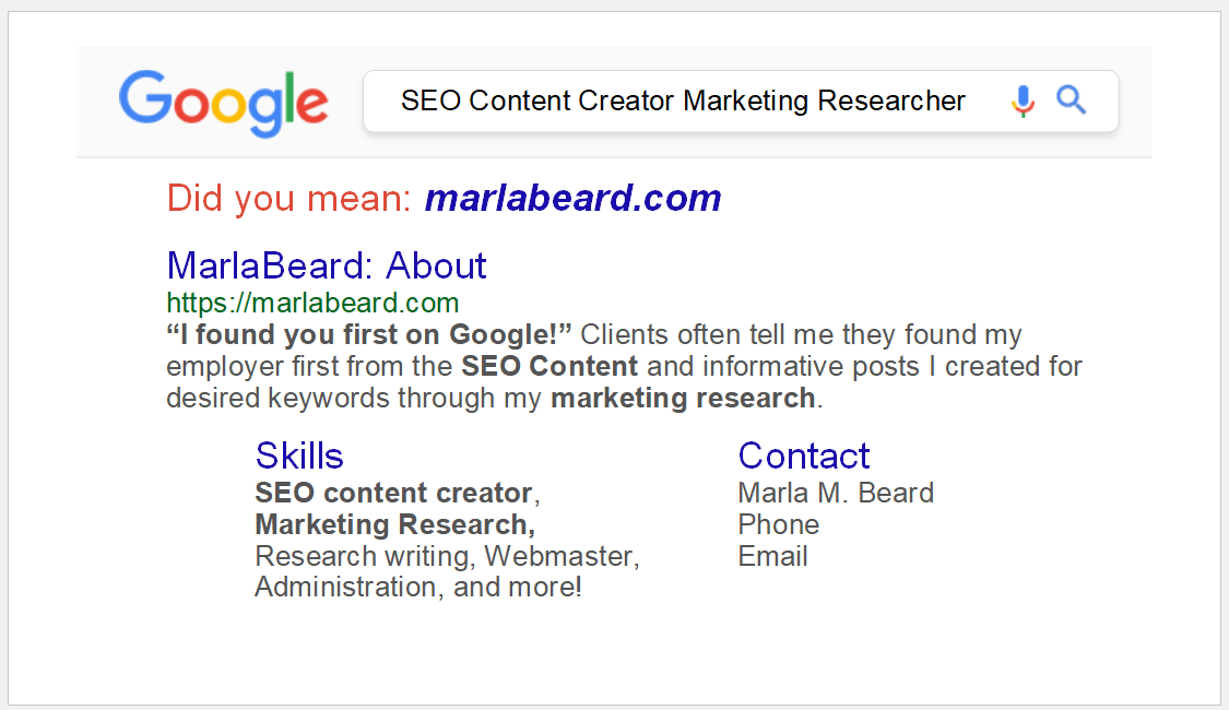
I found that Microsoft Publisher is not a supported file type for uploads to WordPress, so I have provided the main steps, fonts, and color codes I used. The skills and contact sections are separate text boxes from the main results snippet, so those sections can be shifted around to fit the text as needed.
Business Card Type
I use a template for sizing to print on Avery Clean Edge Business Cards #8870. Here’s the link to find them on Amazon. If you choose to print them yourself, I don’t recommend using the perforated cards because they tend to be a bit “fuzzy” no matter how carefully you separate them.
Google color palette
Icons
This is the current Google color palette for the icons from the update in 2015. By current, that means what is current as of the time I am writing this in 2018. (Who know how it will look in a year from now?) If copying this look, it is important to note that the font colors are not an exact match with the icon palette. I didn’t realize this at first; the green was too “washed out” looking to stand alone as a font color.
- Red #DB3236 RGB: 219, 50, 54
- Blue #4885ED RGB: 72, 133, 237
- Green #3CBA54 RGB: 60, 186, 84
- Yellow #F4C20D RGB: 244, 194, 13
- Gray background behind search window: #FAFAFA RGB 250, 250, 250
Font Colors
- Title (Blue font top link): #1A0DAB RGB: 26, 13, 171 On google: 18pt, on card: 8pt
- URL (Green font): #006621 RGB: 0, 102, 33 On google: 14px, on card: 6pt
- Snippet (Gray query summary): #545454 RGB 250, 250, 250 On google: 13px, on card: 6pt
I didn’t find it necessary to include the row to narrow down search results by “News, Images, Videos, Maps, More, Settings, Tools” or the listing of how many seconds it took to come to the results. There is very little space on the card, and in order to get all the words on the card, I had to use 6pt as the smallest font. I just couldn’t go smaller than that and make it legible.
Find colors/fonts
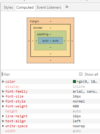
To get any other color that isn’t listed (and when Google changes its look again) you can get color codes with a Chrome extension called “ColorZilla” or right-click on any element to reveal font styles/hex/RGB codes, etc or use Ctrl+Shift+I. Under the Elements selection, select “computed” which should be in the upper right corner, to get a display with color codes and fonts like this:
Design
You must be thinking—why not do a screenshot and add it to the top? That would be A LOT EASIER. I did that first, planning to crop a snip out of the middle because a standard search box wasn’t the precise size I wanted. It’s a bit like the old joke of how you get an elephant into a refrigerator. Yes—simpler ways of doing this were attempted, but it doesn’t reproduce as well as doing it “from scratch”. With a screenshot, the images had to be shrunk so much that it came out a bit blurry.
I’ve done a lot of design work in many programs including Microsoft, so I’m rather quick with it. Finding the added elements was really the only challenge.
The design can be done in any order using Bring Forward or Send Back on any elements, but the most goof-proof way of building the look is this:
Gray area
Insert a shape which is the gray area behind the Google logo and search box. Starting from the top, use the dotted blue guide lines to add the gray area for the header of the Google page. You can’t see it very well when you’ve added the gray background behind search window because it’s so faint. This is the exact Hex/RGB: #FAFAFA RGB 250, 250, 250 to fill the shape. Do not use the shape outline.
There is a very faint, slightly darker gray line below that gray area which would usually include “News, Images, Videos, Maps, More, Settings, Tools”. I was so hesitant to add the line because I like to keep the edges as clean as possible in case the paper feeds a bit askew. But that bottom line really makes it look polished.
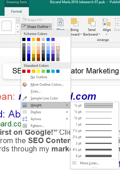
I added a line using the Insert/Shapes menu and used: ¼ pt line weight, 2nd darkest gray:
Search box
For the “search box”, I used the shapes menu, rounded rectangle. When you insert a rounded rectangle, it will be rather large with a big black outline. Just like the bottom gray line, I used the 2nd darker gray and 1/4 pt. weight for the outline.
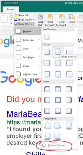
For the shadow, I used Shape Effects, Outer, Offset Bottom. It won’t look right at first until you use Shadow Options to keep the shadow from being too dark.
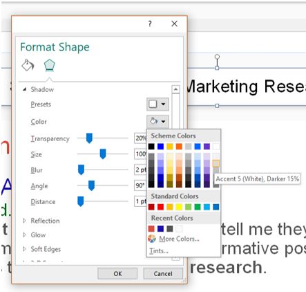
These are the settings I used for the Shadow Options. It’s the 2nd gray, just like the outline.
- Transparency 20%
- Size 100%
- Blur 2 pt
- Angle 90%
- Distance 1 pt
You can insert a text box over this shape. For this text box, I just added a text box and positioned it to get the text at 8pt precisely in the middle.
I added the Google logo (in PNG so that it doesn’t interfere with the background color) and found a PNG file of the exact microphone for the search box. I couldn’t find the search icon (magnifying glass) in the right blue, so I found a similar icon in black and used paint.net to substitute the black pixels for: Google Icon Blue #4885ED RGB: 72, 133, 237
Here are the icons I added:




I’m adding 2 versions of the magnifying glass search icon. I’m still vacillating on which one I prefer, so here’s both.
Search results section
As mentioned previously, the “search results” are done in text boxes, so they can be shuffled around as necessary.
All text box fonts are Arial Regular in 8pt and 6pt. In this example template, I have listed the font size for the various sections.
To change the color of the font, select font color from the Home/Font menu, select More colors, and click “Custom” to put in the precise RGB numbers.
Just one request—if you’re in Indiana, please don’t use this—I’m on a jobsearch right now, and I can’t stand out in quite the same way if somebody else in my area is doing this.
If all these steps haven’t scared you off, good luck!